You can find all our articles and past events
Free Articles | Inside PMO | PMO Conference | PMO Book Shelf
Easing into Data Analytics \ PMO Trends for 2019
In this article, Nicole Reilly, who, to be fair is our go-to gal for anything to do with data, dashboards and tool stuff, picks up on the current trend on data analytics. If you’re one of those PMO practitioners who are trying to get your head around all of this at the moment, this is the article to get you started. Here’s Nicole:
Trends published for 2019 confirm that better data analytics and reporting is a hot topic; PMO Flashmob posted their trends and in this article from Daniel Newman on Top 10 Digital Transformation Trends For 2019 it’s number five on the list.
I’ve posted before about my belief that PMOs haven’t quite got to grips with maximising the value of data and providing business insight. So over the Christmas break, I’ve spent some time thinking about some top tips I can offer, given my background in business analysis and continued interest in the topic.
Back in late 2017 the Project Data Analytics community launched with the intention of exploring and sharing how to leverage big data, machine learning and AI within a project, programme and portfolio environment – with one of the key questions being how can we move from lagging to leading indicators that ultimately improve project delivery outcomes?
Throughout 2018 audiences at the monthly events in London have regularly been in excess of 100 attendees, clearly demonstrating the level of interest around the topic from both data scientists and project professionals.
Why do so many people show up to the monthly community meet-ups, when there are a wealth of books or free resources available on the web? I believe the answer is fairly simple – we want to connect, and to hear the stories; we want to know who, what, how, where and when the challenges faced were overcome; and we want to meet others who are on the same journey and are willing to share their experiences with us. 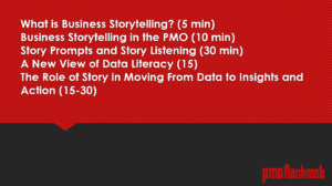 In her session at The PMO Conference in 2018 Lori Silverman explained how to give data a voice and why it needs more than just numbers to get the message across. Lori stresses that “It’s not enough to wrap graphics and fancy visualisations around data and deliver them in a slick package. All data has a voice. How do you get it to speak? First, you need to extrapolate meaning from it, and then you must transform this meaning — these insights — into compelling stories that move people to shift their thinking or change their behaviour.”
Lori has written several books about the power of storytelling, structured in ways that heighten recall. I also like this article published by Medium.com on the 10 Simple Rules of Visual Storytelling, not least because it references some of my favourite movies to illustrate the points being made!
Visual storytelling has long been a thing in the marketing industry; consider the power of advertising, and more recently social media such as Instagram as big brands seek to reach customers with visually stimulating and engaging content. “Facts bore, stories sell” has long been the mantra of content marketing strategists.

Just as in the movies referenced in the Medium.com article above, context and flow are crucial in visual storytelling. The audience needs to absorb and use the information in a visualisation without distractions; lack of flow means lack of communication. And as many knowledge workers already know, interruptions and distractions kill the flow.
What Story Are You Telling?
![]() Unfortunately, the tools that PMOs typically have access to do not lend themselves to great visual storytelling. Microsoft’s Excel and PowerPoint (or their Google-based equivalents) certainly have a place in the PMO toolbox – as does a PPM solution for more streamlined collaboration and coordination of project delivery, whilst providing a source for related metrics and data – but when it comes to providing valuable business insight that is readily accessible, all of these tools fall short.
Unfortunately, the tools that PMOs typically have access to do not lend themselves to great visual storytelling. Microsoft’s Excel and PowerPoint (or their Google-based equivalents) certainly have a place in the PMO toolbox – as does a PPM solution for more streamlined collaboration and coordination of project delivery, whilst providing a source for related metrics and data – but when it comes to providing valuable business insight that is readily accessible, all of these tools fall short.
A dashboard is a key tool for visualising and communicating important business data to stakeholders and employees within an organisation.
 Tableau is a leader in Gardner’s Magic Quadrant for Analytics and Business Intelligence Platforms, and according to their website, their mission is to help people see and understand data. Tableau isn’t free, but trial subscriptions are available from the website. Other similar tools I’ve used are Microsoft PowerBI and DOMO.
Two useful white papers on dashboards have been published by Tableau – “How to Build Dashboards That Persuade, Inform and Engage” and “The Do’s and Don’ts of Dashboards” [Head here to take a look]
Both papers stress the need to minimise distractions and maximise flow when visualising data in dashboards. They also emphasise that the audience comes first, always. This is because different audiences will need different dashboards. The same data can tell different stories, depending on what the audience wants – and needs – to hear. Considering the audience helps define the context and helps set goals for creating dashboards; your mission is to help the audience experience flow.
Three key points feature in both papers;
- It’s critical to set aside your own perspectives on the data and ask questions; what does my audience need? How often will they look at this data? What do they need from it? What do they already know about this subject? Have they used dashboards before?
- Remove everything you can; excess information, confusing graphics or unnecessary features can make a dashboard difficult to use or understand.
- How do you know if something is clutter rather than emphasising the point? Show your work. Build trust, publish often and remember that your designs are for your users and should resolve around their needs, not your preferences. Having a real or virtual wall helps, creating opportunities for feedback and improvement. Ask what to remove, rather than what’s missing.
Top Tips for Creating Dashboards
- Great dashboards require thoughtful planning, informed design and a critical eye.
- Minimise colours to prevent visual overload; pick a colour palette and use it consistently throughout your visualisations.
- Consider display size; don’t build for a desktop if your audience will be viewing on smartphones.
- Plan for fast load times; fancy graphics mean nothing if your busy audience becomes frustrated and disengaged by being made to wait.
- According to Tableau (and in similar research conducted around website design), most people start scanning on-screen images in the top left-hand corner. So make sure to put the most informant information in the hot spot!

This eye-tracking heatmap illustrates the point perfectly; to find out more have a look at this [Wikipedia article]
- Add interactivity to encourage engagement and exploration. But make sure you provide clear, simple instructions for your users!
- Use tooltips – little pop-up boxes that tell mini-stories about the data as you hover over or click certain areas.
- Eliminate clutter by viewing your dashboard from the perspective of someone who’s never used one before.
- Test; are titles and labels consistent in font, size and orientation? Do tiles move depending on the device used to view?
- Avoid jargon and metrics that the audience won’t understand; this is where different versions of dashboards will be relevant depending on the audience.
As the trend from PMO Flashmob stated, “Project data analytics really cannot be ignored and 2019 is the year where we start to learn what it is all about and how the PMO can utilise it.” For many, the journey is just starting and we’re ready to start learning as much as we can.
More about Nicole
 Nicole is an independent PMO, business analysis and project management consultant with over 25 years’ experience in operations and change. Her specialisms include improving change delivery capabilities across projects, programmes and portfolios, and leveraging PPM solutions (tools) to drive better business outcomes. You can find out more about what she does [on her website].
Another good place to hang out is Nicole’s PMO Break Out Area Facebook group where PMO people huddle to discuss and swap insights. You can also find her at PMO Flashmob 🙂

Great article, very concise and clear. Thank you Nicole.