Search the PMO Library

You can find all our articles and past events

Free Articles | Inside PMO | PMO Conference | PMO Book Shelf

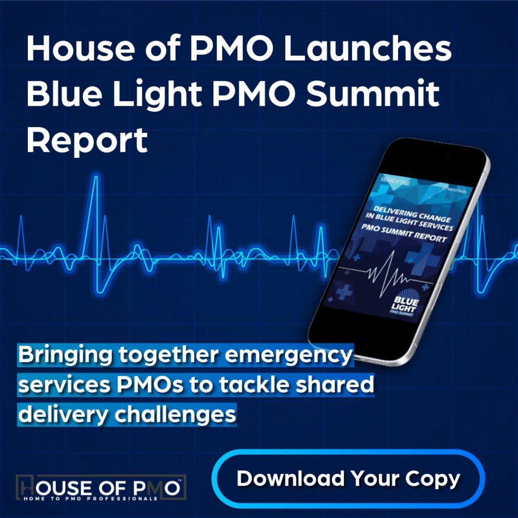
Project Data and Stories for the PMO

At the end of June, in the hottest day of the year, a few PMO Flashmobbers attended a weekend event that PMO Flashmob and PMO Learning were sponsoring.

The Project: Hack organised by the Project Data Analytics Meetup team is a two day event aimed at getting the project community closer to the data science community so skills can be combined and magic can start to happen. The next one is in October (12th and 13th) if you’re interested, take a look here.

We’ll be letting you know what magic we created soon but in the meantime we wanted to share some insights from a Masterclass that took place on the day. These were one hour sessions from the people that really know their stuff. In this one, Rishi Sapra talks about storytelling with data and he shares some real practical advice and resources.

Here’s what we learnt:

Why Stories?

The reason why storytelling is synonymous with data is the need for people to understand what the data is telling them and  take action based on the insights the data is revealing.

There’s a whole raft of reasons why its needed and if you’re interested in stuff like neuroscience and psychological reasons here’s one article to read to get you started.

What Kind of Stories?

There’s lots of different types of stories that can be used, in this session, an ‘essay’ structure was taken as the main example that works well with project data. What we’re looking for with a story is guided exploration, something that is well structured; gains attention and holds it; uses restricted visuals; shows carefully curated data and enables arguments to be presented with explanations and evaluations given.

What Tool To Use?

In this session, Rishi was using Microsoft Power BI. It’s fairly easy to understand and use and there are a LOT of resources and help out there on how to get started. You can do further with inexpensive training like this one from Udemy.

One really useful place to take a look at is the Power BI community – something called Data Stories Gallery. This is the place to get inspiration and get inspired on what you could be doing. There’s some brilliant visualisations of data from all sorts of places.

The Essay Format

Here’s the advice on how to pull together an essay type story:

  1. Start with the audience – who is it aimed at? what are they interested in? what key questions need answering?
  2. Pick your arguments
  3. Plan the layout – storyboard your messages; use a grid layout and use a wireframe.
  4. Choose your visuals – you’ve got a lot to pick from, some examples mentioned:
    1. Bar charts and line charts (the most popular)
    2. KPI cards
    3. Bullet charts
    4. Waterfall
    5. Scatter plot
    6. Table and matrix
  5. Minimise clutter – simplify text and numbers, remove gridlines from charts, ensure data labelling or axis labelling.
  6. Provide context – with the measures and visuals
  7. Use colour well – use it sparingly, use it to highlight.
  8. Use cross-filtering and drilling to bring out insights
  9. Let the AI work for you – use what Power BI can offer, experiement, try different options.
  10. Guide the story

In just one hour we learnt a ton of stuff from Rishi, all really exciting possibilities for the PMO to get better at the reporting they do.

If you’re interested, see the rest of the resources below and start thinking about stories in your project reporting.  

Demonstrating the report in Power BI

What Next?

Watch the video of the session: Take a look at this really great elearning resource on data storytelling:

Take a look at the recommended whitepapers from this firm:

Was this article helpful?
0 out of 5 stars
5 Stars 0%
4 Stars 0%
3 Stars 0%
2 Stars 0%
1 Stars 0%
5
Please Share Your Feedback
How Can We Improve This Article?

Submit a Comment

Table of Contents